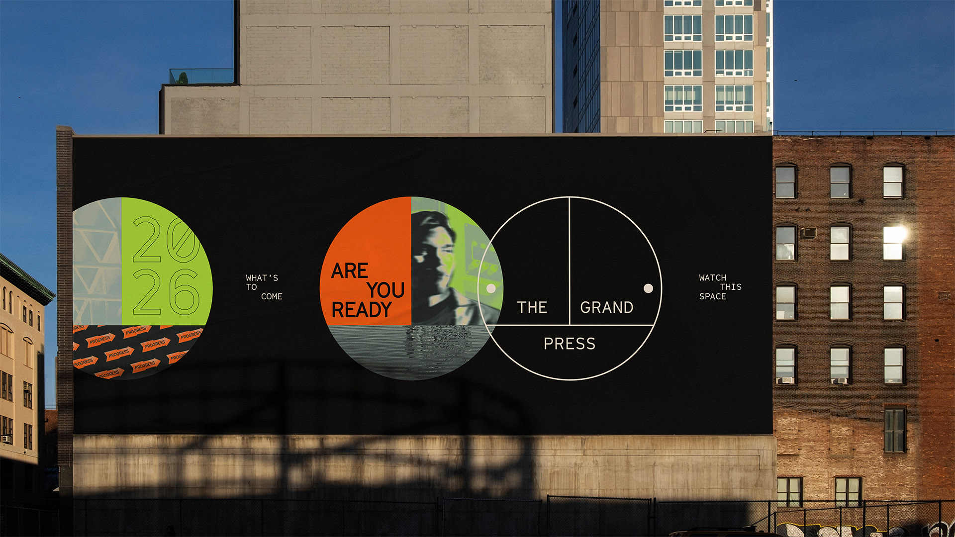
DixonBaxi draws on Printworks’ legacy for The Grand Press branding
For a new workspace in the former Daily Mail print works and Printworks London venue, DixonBaxi created a design system drawing on its heritage.
DixonBaxi has created the brand for new workspace The Grand Press, located in the Harmsworth Quays building most recently used as the club Printworks London, but originally the printing press for the Daily Mail and Evening Standard from 1989 to 2013.
The Grand Press will be located in the front half of the building, while there are plans to retain a cultural venue in the back half, with news that the operator Broadwick Live has a provisional deal for a revamped Printworks opening in 2026.
“We’ve been working with British Land for over five years and having recently created the brand for Canada Water, this project was a new and exciting addition – to define the future of a landmark space at the heart of the neighbourhood”, says DixonBaxi strategist Alice Auxenfans.
“We were tasked to create an entirely new brand identity for the iconic building, as well as a strategy to inspire the new offerings that will be available in the area”, she says.
The identity needed to “embody a spirit of reinvention and scale of ambition proportional to the monumental size of the building”, says Auxenfans. As well as conducting stakeholder interviews, “to fully understand the vision for the space”, it was important to “formulate a strong connection with the building’s history” and capture its distinctive architecture.
In order to “pay respect” to the building’s former uses, “photographing textures and architectural details from in and around the space was paramount”, says Libby Tsoi, senior designer at DixonBaxi.
She explains that the team found “an abundance of signage” on site visits, left over from different periods of the building’s use.
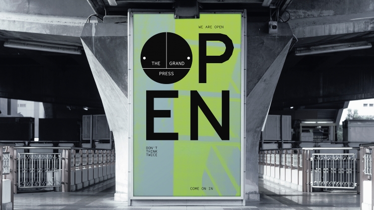
“We found the original signage the most inspiring”, Tsoi says, explain that they took inspiration for The Grand Press logo from “a navigational marker found on many columns throughout the space”.
“We repurposed this into a symbol that evokes the idea and feeling of a meeting point – where businesses, cultures, ambitions converge”, she adds.
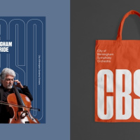
Echoing a three-way split in the logo and graphic device, “inspirational copy often comes in the form of three-word statements”, Auxenfans adds. Serving as a “visual and verbal device”, it creates ties to “the three pillars of The Grand Press: people, business and ideas”, she says.
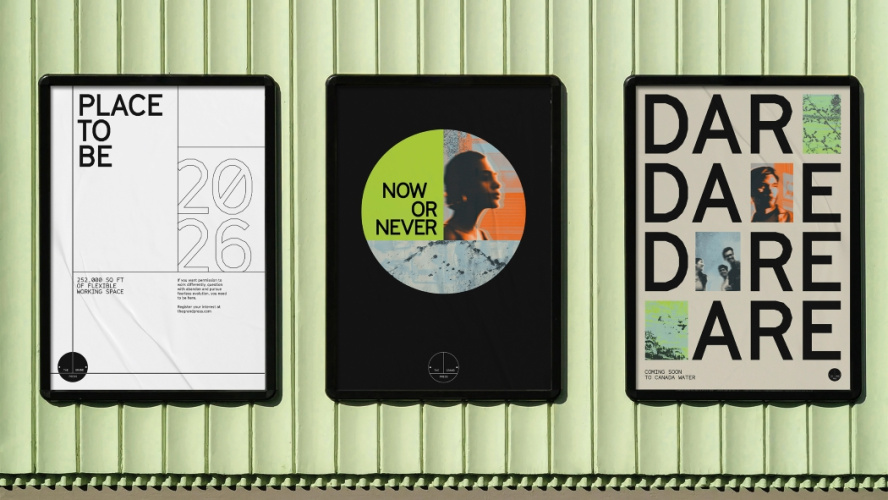
According to Agata Walas-Popiel, designer, DixonBaxi, imagery such as ink splatters and water ripples was also drawn from the building and its surround. A halftone treatment “was applied to these images to pay homage to the printing press history, as well as a brand colour wash to add vibrancy and richness”, she says.
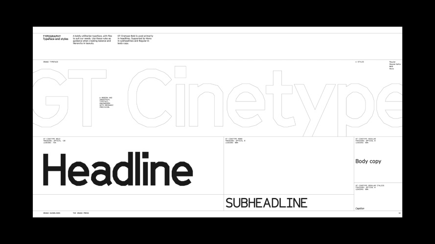
The typeface GT Cinetype from Swiss foundry Grilli Type was chosen “for its geometric nuances that echo the architecture” and “its functional yet expressive appearance”, she adds.
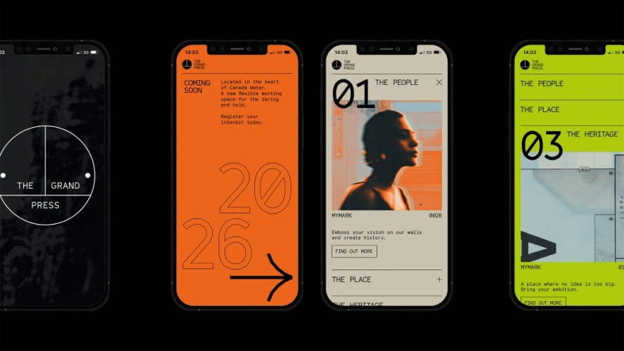
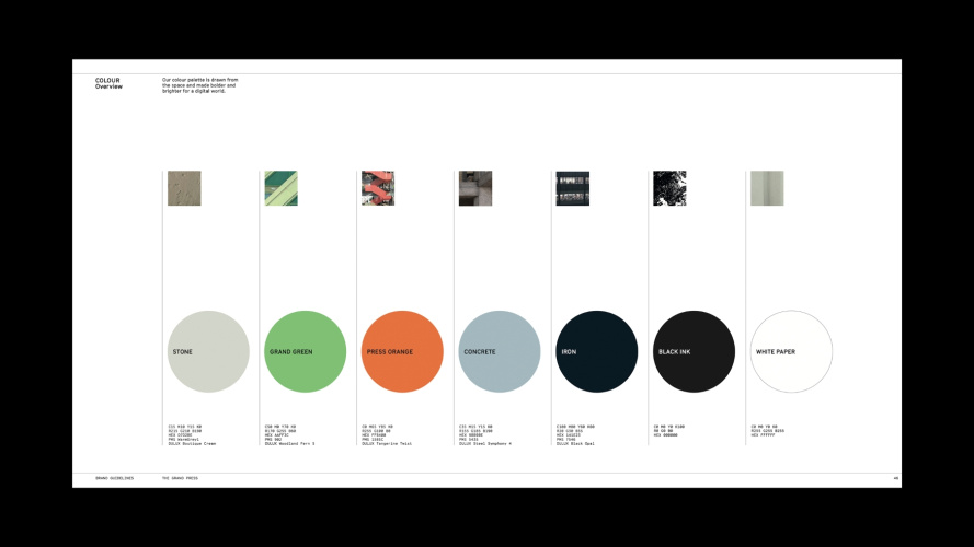
The colour palette includes Grand Green, from the building’s original cladding; Press Orange, “as a reference to the refurbishment”, and other tones drawn from the “iron, concrete and stone” of the industrial architecture, Tsoi adds. “Every step of the way, we wanted every decision to have provenance”, she says.
DixonBaxi also directed a film for the launch event in partnership with Greenaway & Greenaway, which features a bespoke soundtrack “that fuses electronic and orchestral music” and was made for the 12 x 4 ft main screen in the building. Beyond the launch, the brand will be seen across the marketing suite and form the basis of signage systems as the building is developed, Tsoi explains.
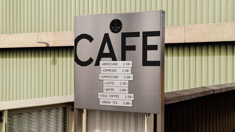
For the planned opening date of 2026, “We are expecting our logo, signage system and typography to be present throughout the building, as well as on anticipatory hoarding in the surrounding Canada Water area”, she says.
-
Post a comment