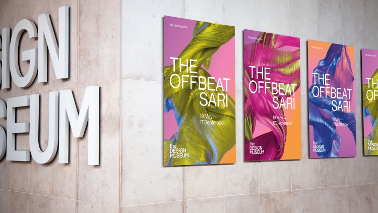
Interior Inspiration: Design Week’s pick of retail and hospitality spaces
From a restaurant in Barcelona inspired by Picasso artworks to a retail space’s circular redesign, here are our favourite recent interior projects.
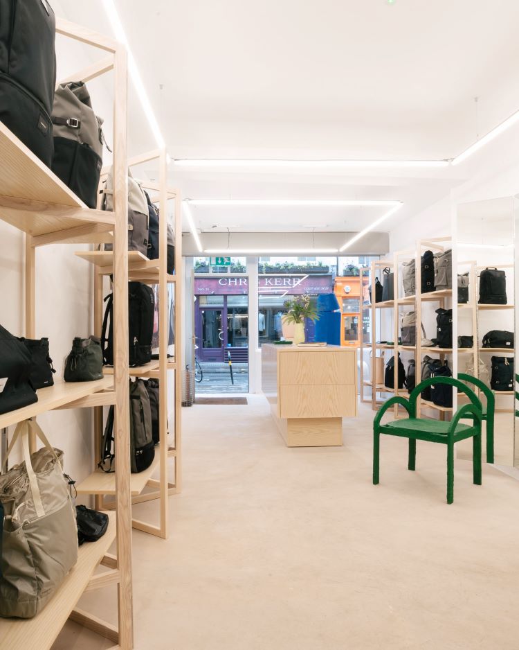
Sandqvist London, by Emmely Elgersma
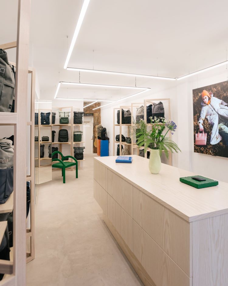
Moving from fixed to modular fittings in a bid to make it easier to change the store layout for campaigns, products and events, Sandqvist took a new approach to its interior design while reinstating its minimal Nordic aesthetic. Its white walls, cool-toned strip lighting and white-stained ash furniture aim to position the products as the focal points, alongside bespoke installations designed and made by local artist Emmely Elgersma to evoke the Nordic landscape.
Sandqvist wanted to adopt circular design principles for its new interior and asked Elgersma to create installations using repurposed materials from its old store, from wooden drawers and stools to shelving. Once the pieces were designed, Elgersma explains how she worked with a carpenter to re-construct the materials into “new forms suitable for the store”, before covering it using her signature finish of newspaper pulp treated with gloss and paint.
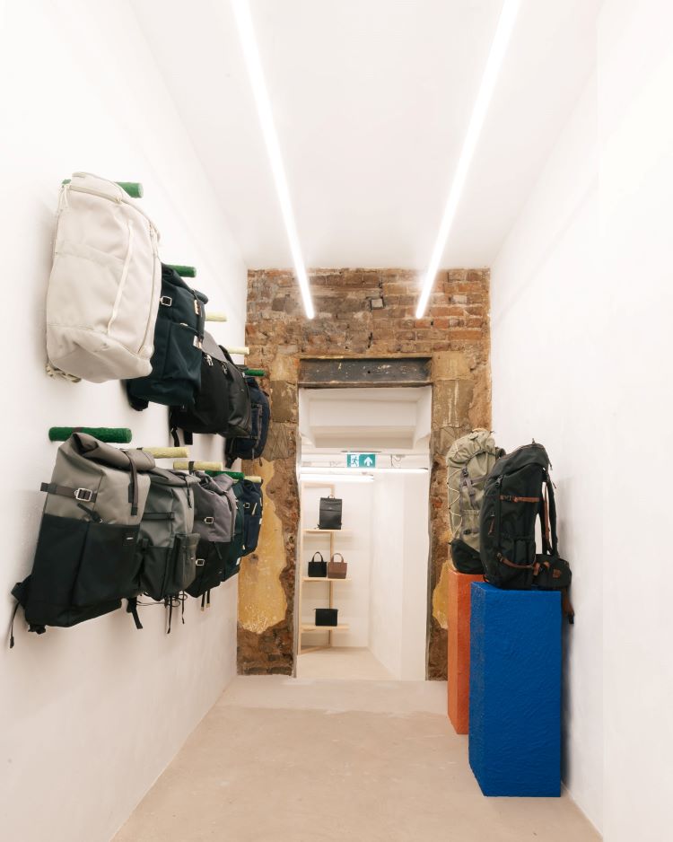
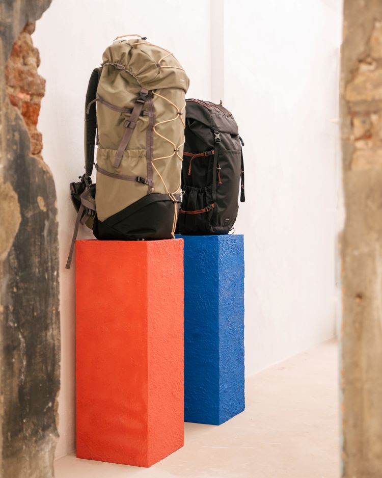
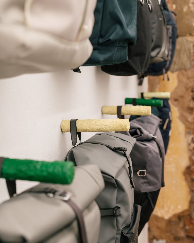
Taking inspiration from images of “vast mountains and textural moss” from Nordic countries, Elgersma says she began sketching the 3D forms, merging the requirements of the brief with her own aesthetic. While she incorporated many soft green colours in her installations, Elgersma says she found opportunities to include “enigmatic pops of colour” which came up during her research of Nordic landscapes. Bold sky blues were reflected on lakes in some of the reference images as well as “bold slices of orange” among autumnal trees, she adds.
In keeping with the updated store strategy, Sandqvist has taken the same approach in other locations such as Stockholm and Berlin, working with abstract artist and designer Finn Ahlgren in the former, and with furniture and interior designer Katrin Greiling in the latter.
1 Warwick, Soho, by Fettle
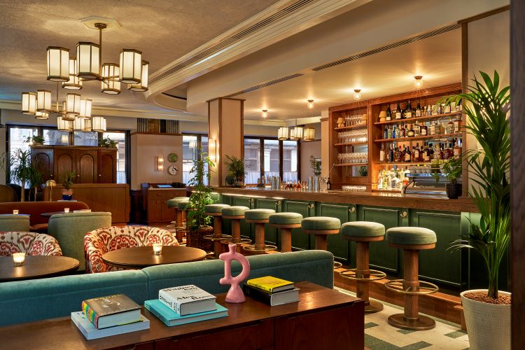
Fettle has collaborated with Maslow’s to design new members’ house 1 Warwick, Soho in an eight-floor, 1910-era Neo-Baroque building. Describing how Fettle took “an honest approach” to the design, the studio’s co-founder Andy Goodwin says that the team tried to “reuse as many of the original finishes as possible”. This meant looking to Edwardian Baroque architecture and basing details such as the skirting, door, architrave and cornice on the styles on the period. The lobby flooring also evokes the Edwardian Baroque style. It was originally constructed in black and white marble but Goodwin explains how the studio “utilised black, white and two different green terrazzo to align with the wider scheme” and make the space feel “more contemporary”. The studio also wanted to draw on the 1950s and 1960s, which it describes as Soho’s “golden years” when the area was home to many “eclectic and colourful establishments”, Goodwin says.
The ground floor bar and restaurant, Nessa, which is open to the public, features autumnal tones across the dining area and is lit by bespoke brass chandeliers with textured glass. Warm, neutral hues are carried through into the members-only spaces, starting with the statement green and white tiled floor, vintage mustard armchairs and panelled wooden reception desk at the entrance.
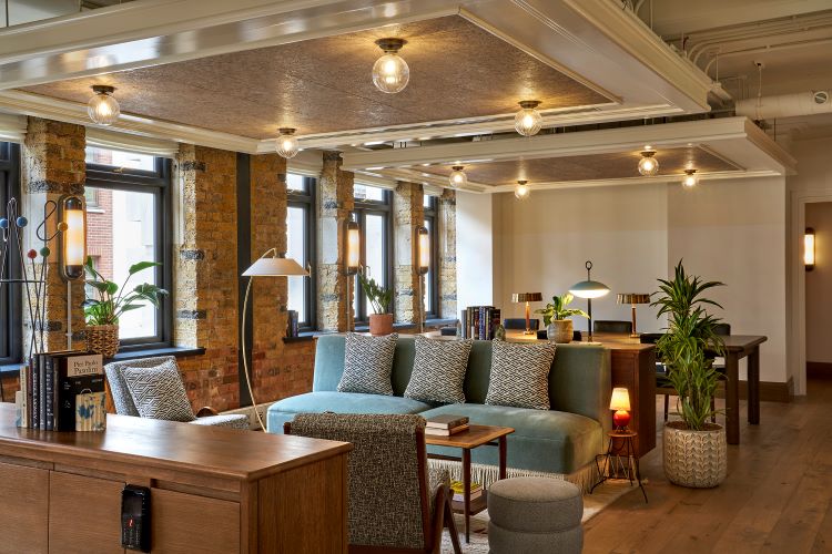
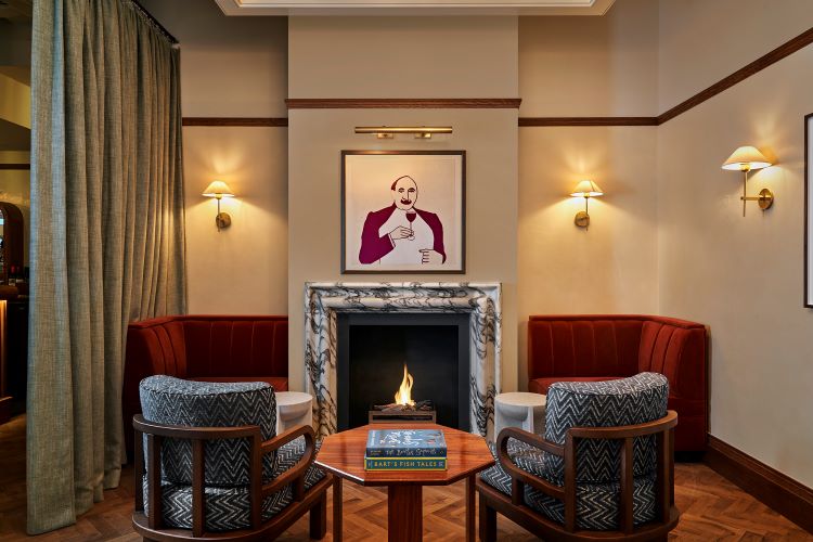
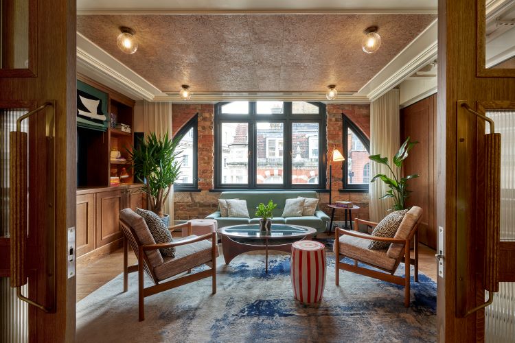
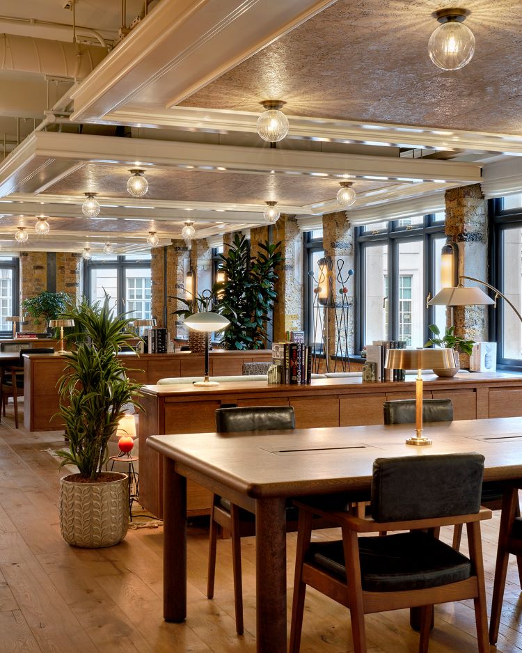
While the space is afforded plenty of natural light on account of the large windows, when evening comes, rooms are illuminated via a collection of floor and table lamps that seek to add to the intimacy of the setting. The feature lighting is bespoke to keep with 1 Warwick’s design aesthetic, according to Fettle. Each level of the building has its own identity, recognisable from its flooring and finishes, from the bespoke terrazzo flooring on the ground floor, to the terracotta flooring and polished raw plaster walls on the sixth floor.
Fettle worked with Studio Mercy to curate artwork for this space, among which is work by arts students from The Chelsea College of Arts.
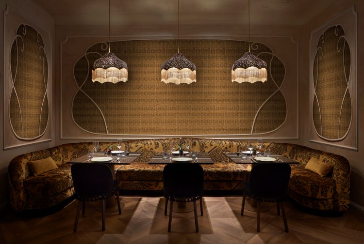
Jacqueline, by Rockwell Group
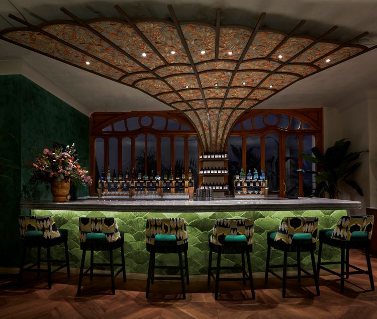
Rockwell Group has designed the interiors of a new maximalist restaurant, Jacqueline, in Barcelona. According to Rockwell Group, the more-is-more approach is inspired by Picasso’s portraits of his muse and second wife, Jacqueline Roque, and also pays homage to the artist’s atelier.
Taking influence from the architectural features of the Catalonian city, Rockwell Group sought to implement the natural linear designs and curves of Art Nouveau alongside the abstract and interchangeable forms of Picasso’s artworks. The ground floor design is modelled on Picasso’s 1955 portrait, Woman in a Turkish costume seated in a chair, in which Roque wears an odalisque costume of red, yellow and blue. The colour palette of the painting bleeds into the Turkish-influenced interior of this space.
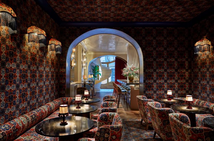
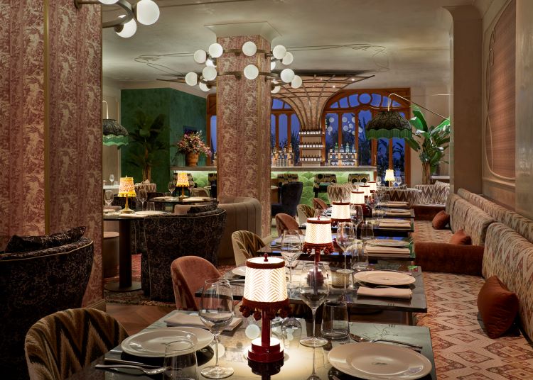
Turkish tapestries adorn the walls in the more intimate lounge, the Padded Room, while a canopy-like palm tree structure made of bronze metal and green mirrored glass (inspired by the palm trees outside of Picasso’s original atelier) shelters the sushi bar. The dark bronze handrail of a sculptural staircase leading to the second floor of the restaurant flows into the champagne bar and then upwards to become the armature for a chandelier.
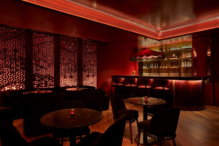
Floral themes come into play in the first-floor bar, referencing Picasso’s 1954 portrait, Jacqueline with Flowers. Pink and purple plaster flowers cover the walls and ceiling, while the bar features a resin dye filled with champagne-like bubbles. Guests are exposed to a completely different tone in the lower ground floor club with its reflective red ceiling, red columns and backlit, laser-cut metal screens. This space aims to evoke the 1959 painting, Woman with Mantilla Red Background I, which depicts Roque in a traditional black lace shawl, against a bright red backdrop.
Blacklock, by Other Side
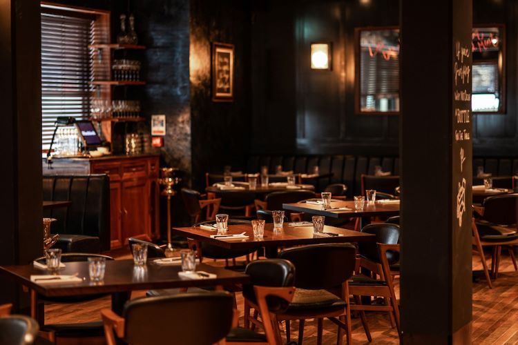
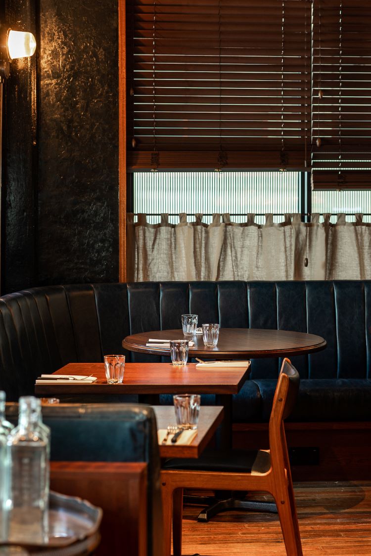
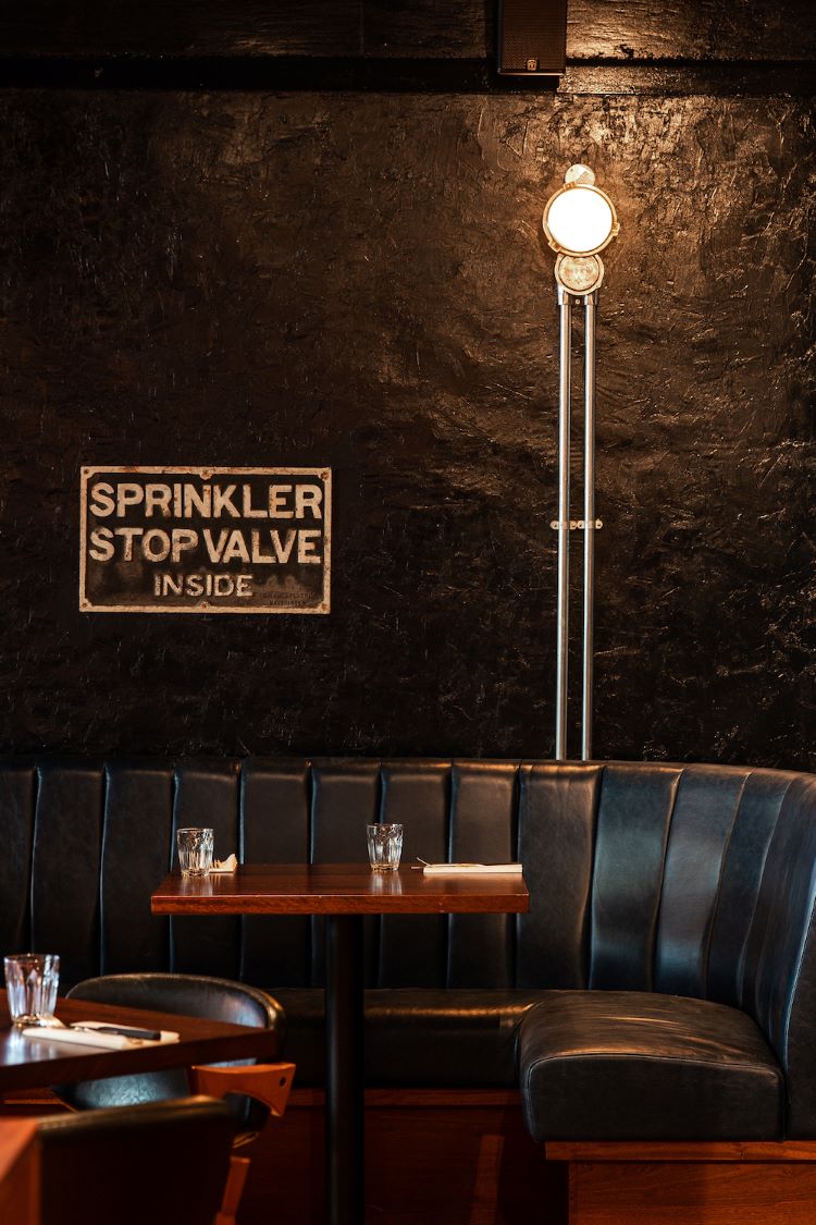
Beneath the railway tracks in North Dock Canary Wharf, Blacklock’s latest restaurant – and its biggest yet – sits overlooking the water. Previously a warehouse, the space has been designed to resemble a New York speakeasy with its black-framed, Crittall-style windows, and material palette of raw metal, exposed concrete and warm timber panelling. Other Side founder Gavin Mayaveram says that this interior style allowed for some preservation of the building’s “original character”.
Keeping in line with the “warmth and nostalgia” typical of a Blacklock restaurant, Mayaveram says the studio opted for cement-coloured floors, dark concrete ceilings and stripped-back rendered walls painted in glossy, deep colours. Much of the materials and furniture are reclaimed, such as the narrow strip floorboards sourced from a local school, vintage reupholstered chairs and antique furniture pieces, which now serve as host and waiter stations.
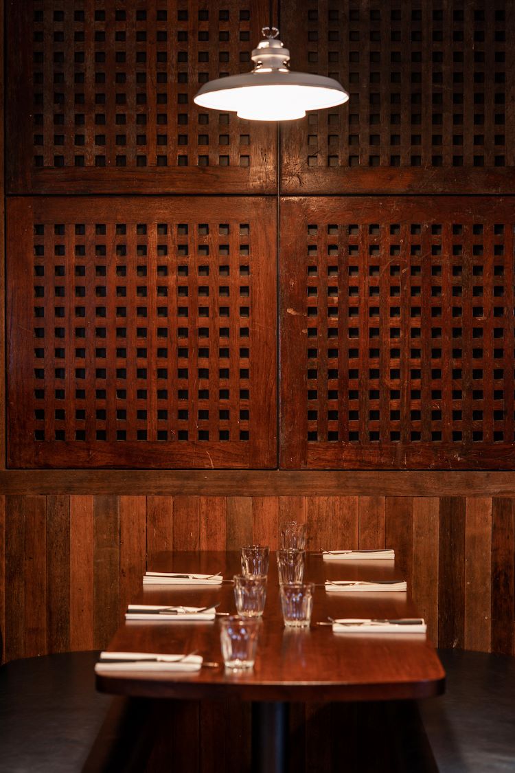
Blacklock Canary Wharf’s waterside location encouraged maritime design references for both the branding designed by & Smith and the interiors. Some of the reclaimed joinery, mirrors and teak panels are even from the HMS Ark Royal, which once sailed up the Thames past where the restaurant is located. Other subtle maritime details include the vintage nautical and industrial lights and the accents of blue in the upholstery, tiles and paint finishes.
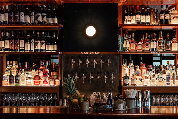
Designed to catch the attention of guests as soon as they enter is the ten-meter-long bar made with vintage leather panels and shaped Iroko bar top, where the African timber is darkened with oil to reveal bronze hues. The warmth of the bronze continues onto the back bar through cladded mirrors and timber shelving. Tapping into the trend for food theatre, guests are able to look through glazing to see the chefs cooking on the hot coals.
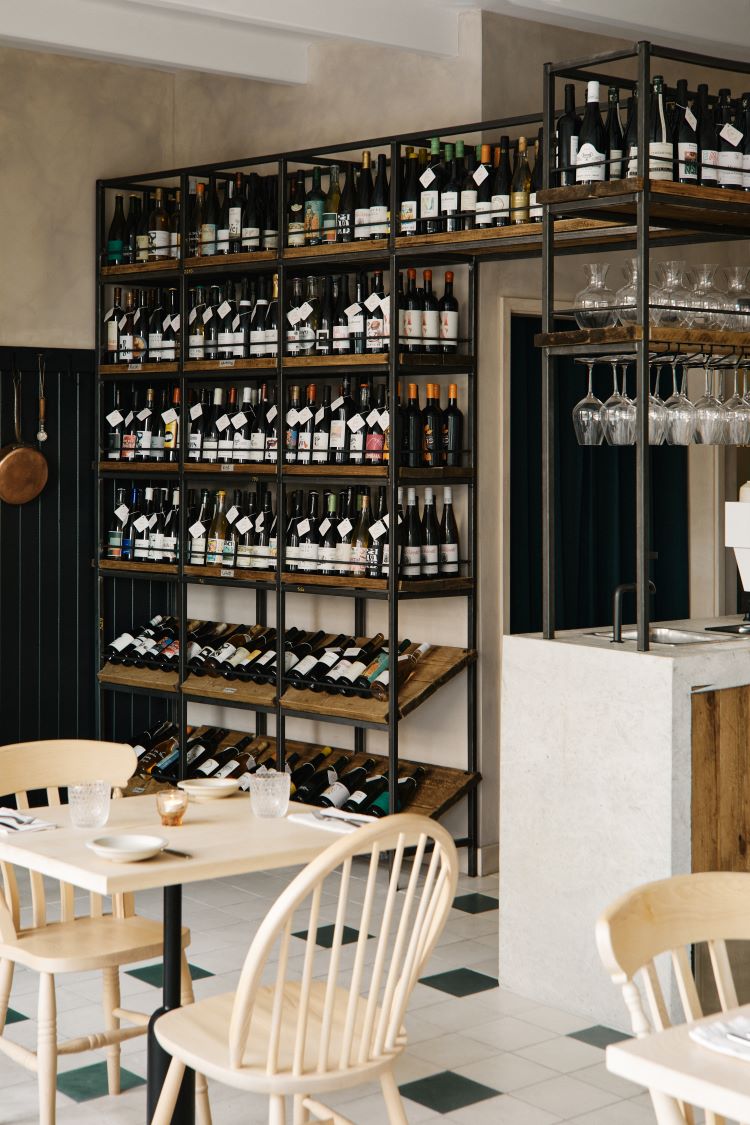
Eline, by Not Limited and Bert & May
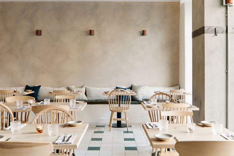
Natural colours and materials form the basis of restaurant Eline’s design concept, chosen to complement its organic menu and natural wine selection. The interior project was led by design group Not Limited, which was co-founded by handmade tile company Bert & May’s interior consultant Louise Curnuck.
Curnuck worked with restaurant owners and couple Alex Reynolds – who is also the chef – and Maria Viviani to create a bespoke patterned layout using neutral-toned Rolling Fog square tiles and the occasional dark green Fennel tile for the restaurant floor.
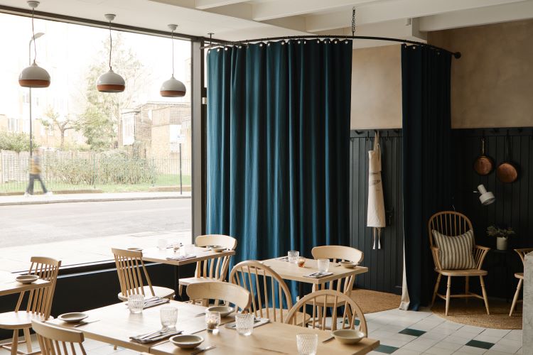
Neutrality continues through the textured wall finish created with limewash paint, as well as the raw concrete columns and pale beech tabletops and chairs. Not Limited added an additional L-shaped bar of cast concrete to the columns in a bid to foster a feeling of homeliness, as it makes the space appear more open. As with the floor pattern, accents of green appear elsewhere in the space on the upholstery and the heavy linen drapes.
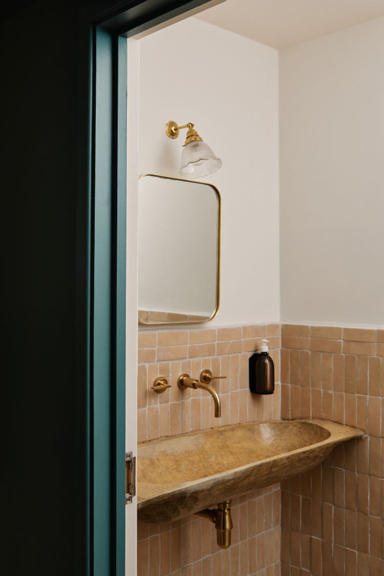
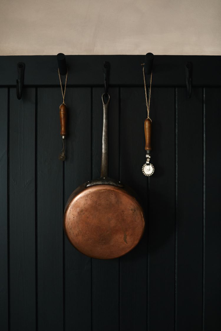
The restaurant’s wine collection sits upon bespoke units made from steel and reclaimed wooden scaffold boards, with utility hooks and metal strap hooks that display copper pots and memorabilia. Bert & May’s handmade terracotta Raw Thick Bejmat tiles are used in the bathroom, identifiable through characterful chips which give the space an earthy feel. The bathroom basins are made from repurposed dough bowls and are adorned with unlacquered brassware by Studio Ore, chosen for the fact that they will naturally age and add to the rustic look of the space.

-
Post a comment