Minute Maid’s new “full of life” global identity
JKR worked on the 77-year-old juice brand’s first global identity, which features hand-drawn illustrations and “juicy drop terminals” in its primary typeface.
Juice brand Minute Maid has a new global identity and campaign made in collaboration between Jones Knowles Ritchie (JKR), Grey, VMLY&R and Landor & Fitch.
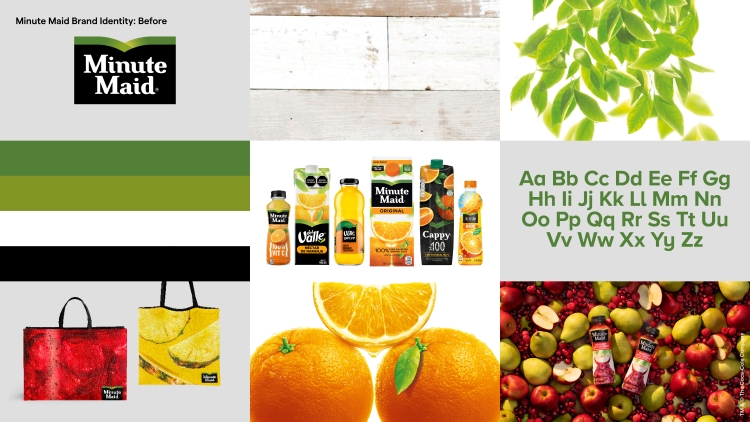
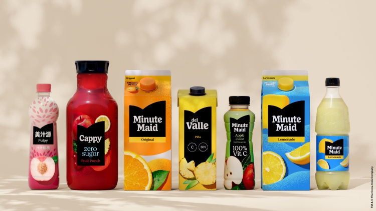
Owned by the Coca-Cola Company, Minute Maid is sold in more than 100 global markets, but while known by this name in the US, is Cappy in Europe and Africa, and del Valle in Latin America – each previously with their own packaging styles.
Rapha Abreu, Global Vice President of Design, The Coca-Cola Company says: “We felt the Minute Maid family was due for an elevation to the icon it truly is”, adding that the project hoped to develop “a flexible global design system centred on what makes Minute Maid unique”.
JKR, which also created Fanta’s new global brand for Coca-Cola, was approached to “refresh the brand and unify it across the portfolio”, says JKR creative director Alex Boulware.
Joining the project in 2021, JKR worked closely with the Coca-Cola design team to “understand the portfolio and unique pressures within each market”, and “worked from audits to cultural insights to portfolio architecture in order to set the creative vision for the work”, he says.
While the brand names will continue to vary, JKR refreshed the core brand’s kit of parts, including typefaces, core colour palettes, illustration style and photography style, “which was adapted into creative campaigns”, Boulware says.
A “broad framework” was designed that “allows the Coca-Cola design team to extend the new brand across thousands of SKUs globally and into future product innovations”, he adds.
According to Boulware, JKR sought to find “opportunities to create distinctiveness” within a juice category that “had settled into a uniform set of visual codes”.
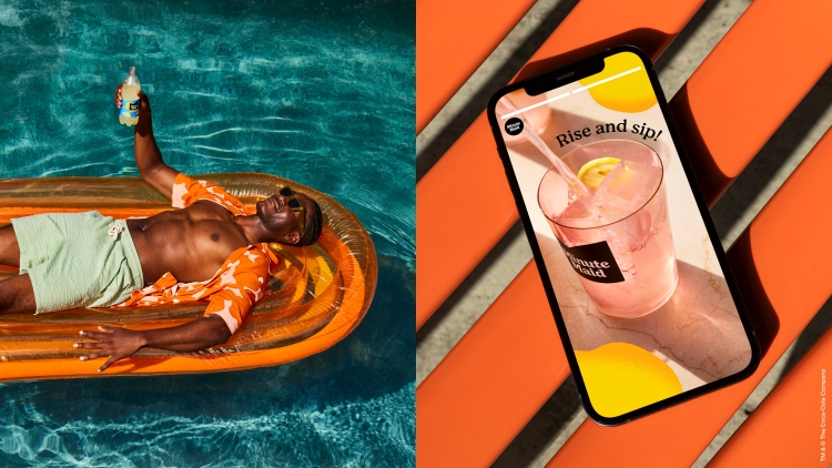
He says that while Minute Maid “has always been filled with life” – which is also the name of the new campaign – it lacked a cohesive visual identity to communicate the brand purpose, and its values of “energy and joy”.
The updated Minute Maid logo adapts its Valley symbol, to reflect the brand’s heritage, as well as its “vitality”, Boulware explains. “The shape symbolizes the momentum of finding a good mood, picking up energy as it moves from left to right”, he says.
Alongside the symbol is the “bold, simple and fun” custom wordmark, whose “rhythmic simplicity and playfulness speaks to Minute Maids’ values”, Boulware adds.
The primary typeface Moranga features “juicy drop terminals and flowing serifs”, while the sans serif typeface Matter, is “quieter and more functional, but equally open and welcoming”, he says. “These typefaces flex the tone of voice across a wide range of communications while keeping a singular and consistent brand impression”.
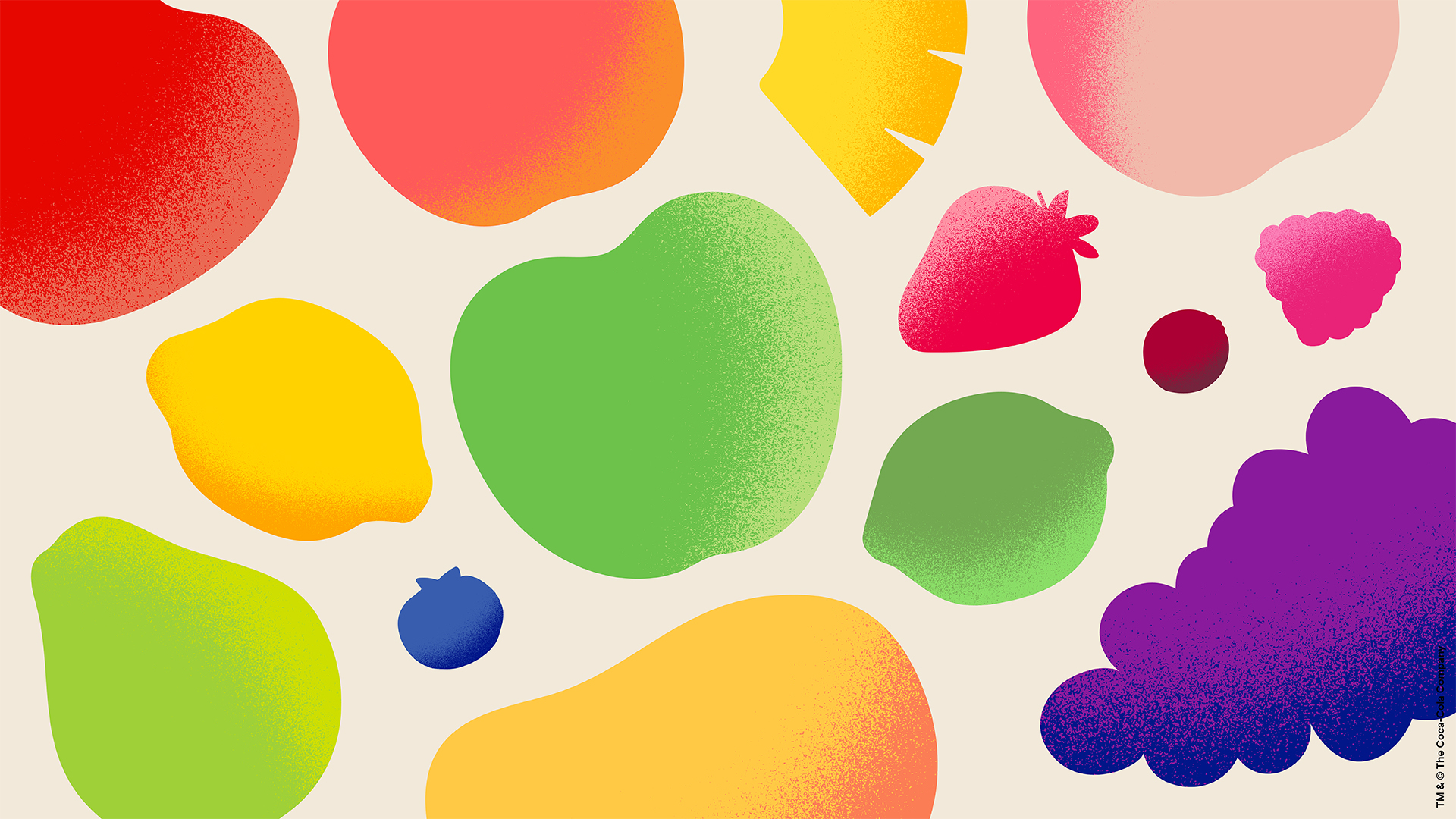
The colour palette is shaped by the fruits of Minute Maid’s products: Orange, Lemon Yellow, Apple Green and Raspberry Pink, all of which can be used “as a flood of colour or as an accent”, Boulware says. Further flavour colours, also inspired by fresh fruit, are used in ingredient illustrations and packaging.
The hand-drawn illustrations featuring a soft grainy texture are intended to “celebrate the individuality of real fruit”, Boulware adds.
“The ingredient illustration is a powerful graphic motif for our brand”, Boulware says. “It speaks to the purest forms found in nature and the minimalism and clarity that are pivotal to the brand.
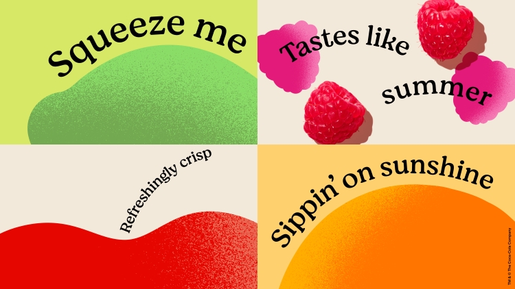
According to Boulware the photography style follows the brand strategy: “simply ourselves, full of energy, effortlessly lyrical and perfectly imperfect”.
The new global identity will roll out during 2023, across packaging, TV, digital and out-of-home advertising, social media and on-ground content.
-
Post a comment