Bad Vibes: Nissen Richards Studio designs Black Metal exhibition
For the National Library of Norway, Nissen Richards designed an “atmospheric” exhibition taking visitors on an emotional journey through the heavy metal subgenre.
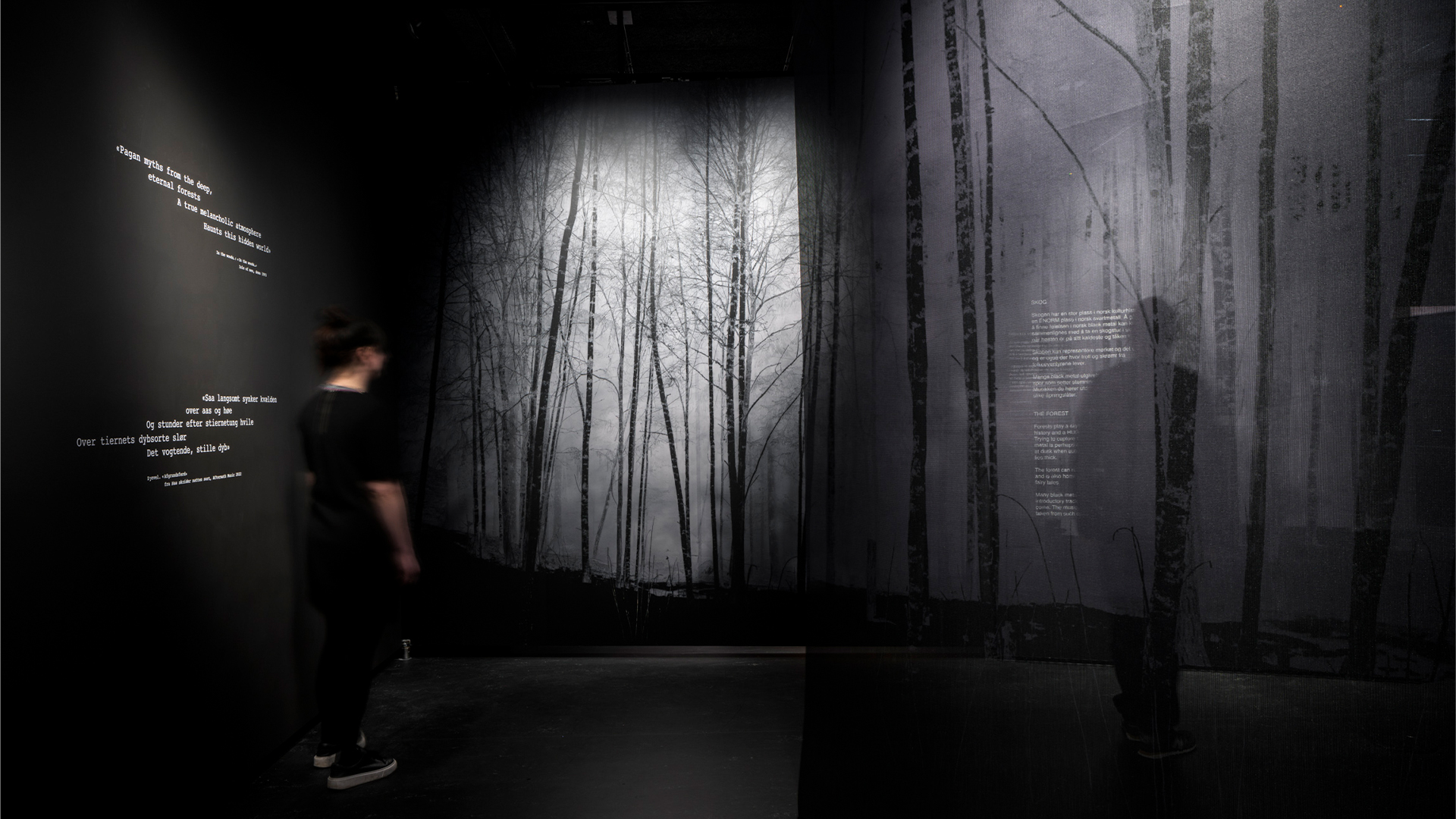
Nissen Richards Studio has designed the exhibition Bad Vibes for the National Library of Norway, exploring the themes and culture of Norwegian Black Metal using “real materials” and immersive scenography.
With Black Metal described by the curatorial team as variously as a “primeval forest of emotions” and both “repellent” to some but “like a kind of medicine” to its devotees, the brief particularly sparked Nissen Richards’ interest, explains studio director Pippa Nissen.
Black Metal is “a very particular thing in Norway”, Nissen says, and with a large scene around the genre in the country, it “is something that is very Norwegian”.
But it is also “quite an emotional scene,” she adds: “If you watch videos or listen to the music or read interviews, people in the scene talk in a quite an emotional way about Black Metal”.
Rather than being exhaustive or historical-chronological, the curators “definitely wanted the exhibition to be like scenography and feel really immersive” Nissen says. But while she notes that “quite often clients say immersive, and then there’s [just] a projection in the corner”, in this instance the curators “really meant it”, she says.
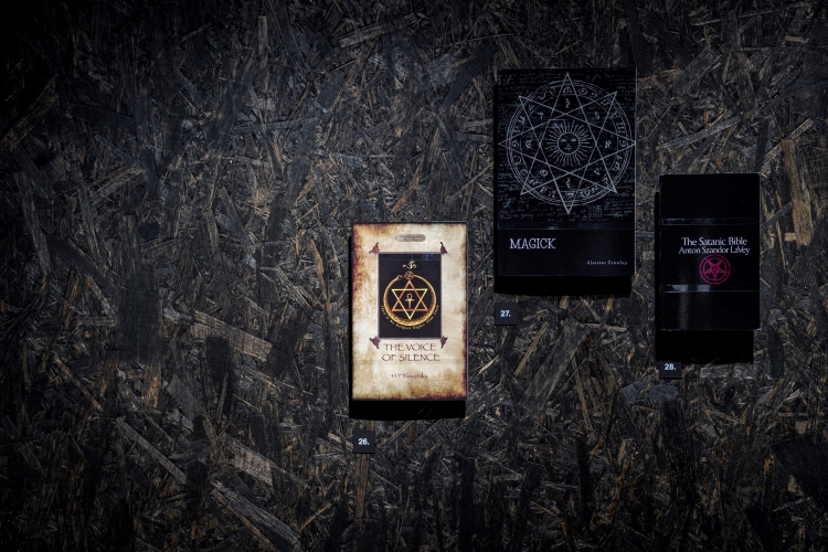
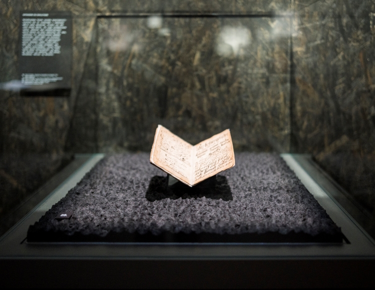
According to the studio, Nissen Richards worked with “analogue, natural, religious and literary sources, as well as plenty of sonic input”, to shape a series of “atmospheres” to explore the genre’s themes.
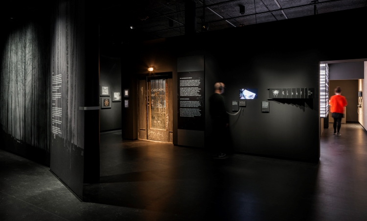
Within the library’s rectilinear and open space, “we created this route through it so you’re taken on this journey”, Nissen says. The studio made use of moveable pivot walls that could be opened out, as well as “gauzes and different building materials” to divide the space so that each section came as “a surprise”, she explains.
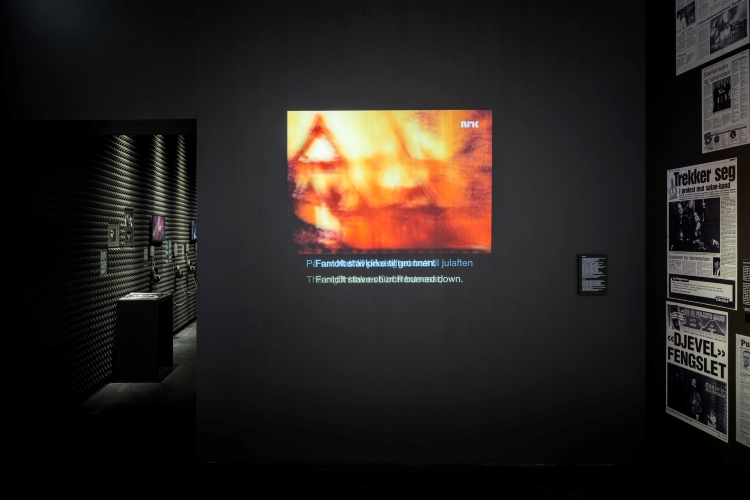
As some of the content associated with Black Metal including a wave of church burnings and murders during the 1990s, to tackle these “difficult” subjects, as well as “more straightforward” sections on musical influences, the exhibition needed to be able to have a “shifting feel”, Nissen adds.
To create the required atmosphere throughout, much of the surfaces are black and the space overall is “quite dark”, Nissen explains: “When you first go in, your eyes have to get used to the darkness, because it is quite a dark exhibition”. Within the darkness, materials are used to play with light in subtle ways, including a metallic Dibond surface, which the studio then printed on, that catches the light and changes as visitors move towards it, says Nissen.
Within the exhibition are a number of different roomsets, from the forest entrance to the doorway of a renowned record shop called Helvete, meaning Hell, to the poster-clad walls of a teenage fan.
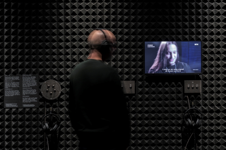
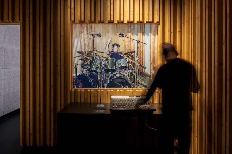
Elsewhere immersion is achieved using “real materials – like the foam from a recording studio, or this timber slatting which is very particular to a recording studio in Bergen called Grieghallen”, Nissen says, while Oriented Strand Board (OSB) stained black, gives a deliberately “rough” aesthetic to the space.
Further details include buttons that play audio-visual content arranged in a pentagram shape, while Nissen adds that some elements came from the client themselves, who “really went for it with us”. This included discovering a particular black foam that can be used in an exhibition context, as it is stable and can sit next to objects, Nissen explains.
Much of the materials on show are “analogue”, such as zines, tapes and album covers, which Nissen notes she particularly enjoyed worked with, “because I guess I come from an analogue world”.
The “low-tech theme” is carried through into the graphics, she explains. “Things are broken down a bit, or there’s interference, which is another theme we worked with in the graphics. Things are being interrupted, but when you go round the exhibition, it’s very subtle”.
With an interplay between these “real materials and graphics”, she notes, “part of that is value engineering, but actually it works with it – and probably works better”. While the budget was relatively small, Nissen suggests that the level of trust built with the client allowed the team to push the project.
All images by Gareth Gardner
-
Post a comment