Magpie’s identity for paint alternative Aero looks to tell sustainability and performance story
Aero’s suite of graphic devices, including six 3D animated icons, aim to communicate its environmental and functional benefits.
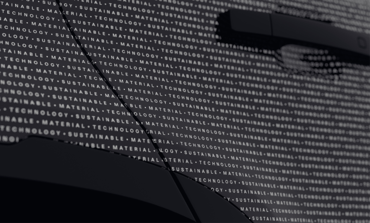
Magpie studio has repositioned film-based paint alternative manufacturer Aero designing its new identity which incorporates a “text mesh” graphic pattern and 3D animated icons.
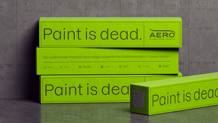
Unlike paint, Aero’s material technology requires no primer, overspray or clear coat. The company also claims that it emits zero carbon, is virtually free of Volatile Organic Compounds and is free of PVC.
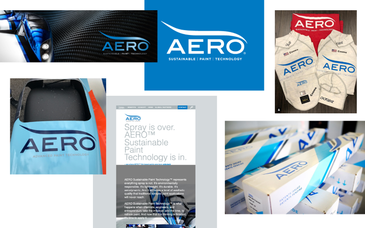
Although Aero’s target audience is “future focussed, design-led audiences” – particularly within the automotive industry due to the product’s “performance and sustainability credentials” – the B2B product’s previous branding was not “befitting of its quality”, says Magpie co-founder and creative director Ben Christie. He describes Aero as “a sophisticated product” made through a highly engineered process so “simplifying the storytelling visually and verbally was key” to the new identity.
To achieve this, Magpie set about organising the product’s attributes and benefits, then sought to communicate them in digestible “bite sized pieces”, says Christie. Six motion-enhanced icons were designed to depict Aero’s qualities, including its recyclability, aerodynamic properties, durability and smart connectivity. Infographics and ideograms also feature on the website to help communicate its properties.
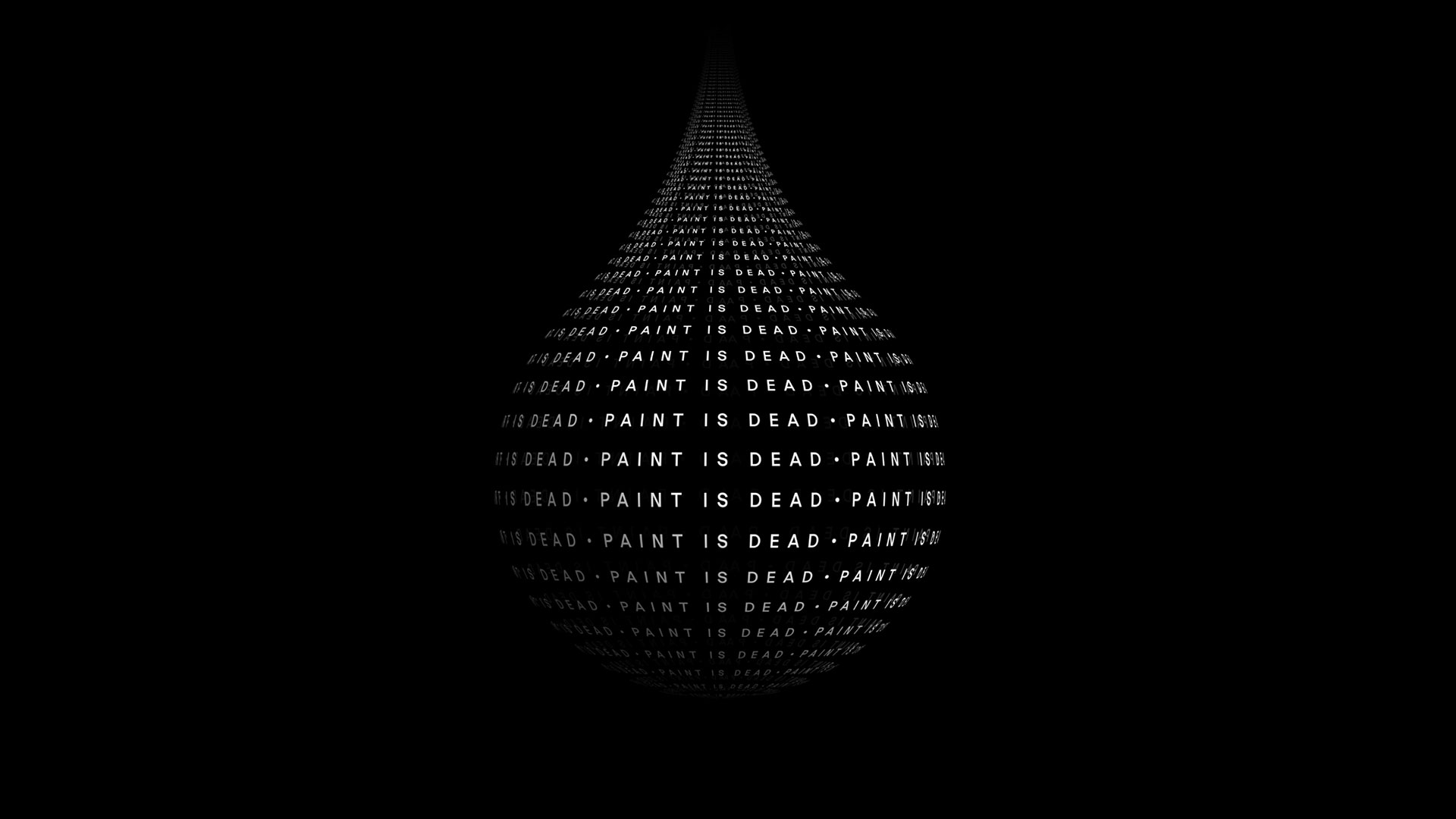
Magpie opted to use a “text mesh” pattern throughout the identity to “represents the product in engaging way”, according to Christie. Christie says that like the icons it “comes to life” through animation “racing across the contours of surfaces to amplify the fact that Aero is a highly technical, sophisticated product”.
Another focus was finding “the right balance between telling the sustainability story” and integrating Aero in “the high-performance world of automotive and motorsports”, he adds.
While Aero has retained the overall form of its wordmark so as not to lose its “brand recognition”, Christie explains that the studio “put it through the [metaphorical] wind tunnel and streamlined” for a “more modern and sleeker” look. He says that Magpie also “rationalised” the previously meaningless S curve as “a sheet of Aero”.
For the typography, Magpie chose Dazzed from Displaay as the display typeface, pairing it with an open-source monospaced font called Jet Brains. Christie says it resonates with the tech theme of the identity but is also “clean and approachable”.
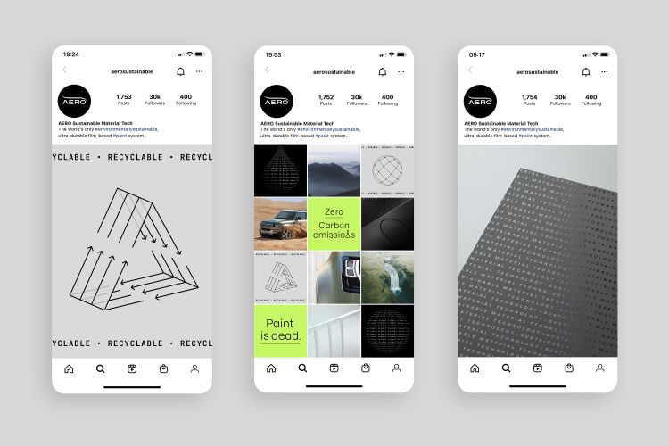
Aero’s new colour palette has a monochrome black and white base accented by a vibrant green hue. As well as “reinforcing the environmental angle”, Christie says the palette “has good energy in both digital and print”.
Read this next
-
Post a comment